This morning in the studio, we were given an inspiration exercise to find fun and interesting pieces that make us smile. These were then shown to the class on the big screen to get the creative juices flowing. As a group, we are all in competition with each other to create the promotional material for our final exhibition.
Here is my (very simple) video of inspiration, appropriately set to 'Pencil Full of Lead.'
emmahart.
Wednesday, 9 March 2011
Saturday, 26 February 2011
Summer WOW
A college brief set over the Summer break to provide words of wisdom for the new first year of the course. Another aspect to the project was to plan out their induction week. As a class we pitched for the job, myself and two classmates won and took charge of the group for three days. We set up an inspiration wall, worked on a brief and presented together to allow them to see how we work. As well as an external mentoring programme, we now have internal mentoring in place to pass our knowledge down.
Monday, 17 January 2011
HND Review Show, Jan 2011
Last week we finally held our Review Show at Edinburgh's Telford College.
This was an opportunity to show our Industry Mentors how our portfolios are coming along before we go off on work placement for one month. The NC and HNC groups were also invited along to help out and to take part in a one hour project together. I got some excellent feedback and am feeling very confident with my progress. You can read more about the exhibition on our course blog and on the Telford website.
Editorial: Excite Culture
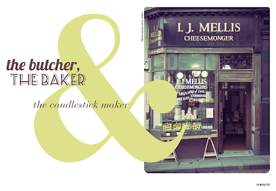
This brief required that we design a weekend supplement magazine for a broadsheet newspaper. We were also required to collaborate with the HND Photography students, briefing them and going along to art direct - a great experience, but very nauseating in the cheesemonger! We then selected our subject matter from a hat. I chose Culture. I decided to do an article on how supermarkets have changed the customers shopping experience; not having that social, community feel of previous days. I treated the images to give a vintage feel and really had fun with the typography.
Sunday, 12 December 2010
CHART Update
Wednesday, 8 December 2010
We first met our industry mentors back in September, we were asked to show them our portfolios...I thought they'd get to see my work throughout the year anyway so decided to show a video that sums me up as an individual. It includes photographs that I've taken, things that make me smile and some of my design and non design related work.
Self Branding

As part of the HND at Telford we are required to create our own branding so that we are ready for the big bad world of employment. I've known for a long time exactly how I wanted to brand myself; clean, crisp and simple to let my work do the talking. I have chosen Bodoni Black as it is a classic typeface that has clearly stood the test of time, not to mention its beauty.
I really adore printing and wanted this to come across in my work, so the main "logo" if you like will be a blind emboss on GFSmith Colorplan Pristine White. I kept the size consistent throughout the stationary to save on cost. This will also be a feature on my portfolio, below.
As so many people now a days have the same black portfolios I wanted to stand out and do something different. This is something that came up when asking for advice from the designers at Whitespace, along with many other valuable pointers.
The swivel concept came to me, like many of my ideas, whilst trying to sleep! I like the idea that this is a project in its own and I guess, it challenges the printing process. The stock will be the same as the above but on 700gsm board - this in itself is a challenge as not many printers can print on this stock. The solution is to print on a lower weight and sandwich it to the board. I feel that the clean white portfolio will be a lovely contrast to the bright full colour images of my work, and hope that when the viewer opens up the portfolio they will be hit with the intensity of the photographs.
(Apologies for the grotty scan! Please email me if you would like higher quality images)
Finally, my website. Initially I thought it was going to be quite difficult to transfer the impact of the blind emboss to web, but settled on keeping it monochrome rather than trying to replicate. Throughout all of my self branding/promo work, the layout of work will remain consistent. I see the website as a way in if you like, something that I can send potential employers/clients to then meet face to face, and hopefully show them my portfolio and my personality.
Subscribe to:
Comments (Atom)


